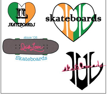
Above is the just text portion of my "Irish Love Skateboards" Logo
above is the two fonts portion of the logo
above is the text and art portion of my logo
this is the balanced art and text portion of the logo. This is my favorite part.
this is the portion that contains more art than text. I like the negative space created by the bend in the I and the L. I think the heart is still visible around the letters. Also, the inspiration for the logo design on the bottom was a deck of cards. I originally thought I should make them orange and green to go along with the theme of the rest of it, but I think it looks better with black and red.


No comments:
Post a Comment
Note: Only a member of this blog may post a comment.