Monday, December 17, 2012
Gotyouinalovepress
This is a very rough version of the logo I'm helping my friend make for his fake publishing company that might someday be real. The heart mimics a tattoo he has. I think I might take the belt off later for a different version and put like a press on either side of the words. Anyway, been doing this in my free time and this is what was produced.
Wednesday, December 12, 2012
Perspective
This is supposed to be a subway of some sort. Does it look 3D? the only thing that really bugs me is the gradient under the bus... I tried to get it to fade nicely, but it just wasn't cooperating. This was an interesting one.
-Erin
Thursday, December 6, 2012
Tuesday, December 4, 2012
Kaden Supports Irish Love
I also don't know if I can use this really, but I like the way it looks. This is my friend Kaden who was showing us his ollie, and I took his picture and outlined it in Illustrator... then I placed that logo on his shirt cause it looked empty. Here's the original photo:
Monday, December 3, 2012
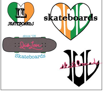
Irish Love Logo Design
Above is the just text portion of my "Irish Love Skateboards" Logo
above is the two fonts portion of the logo
above is the text and art portion of my logo
this is the balanced art and text portion of the logo. This is my favorite part.
this is the portion that contains more art than text. I like the negative space created by the bend in the I and the L. I think the heart is still visible around the letters. Also, the inspiration for the logo design on the bottom was a deck of cards. I originally thought I should make them orange and green to go along with the theme of the rest of it, but I think it looks better with black and red.
Subscribe to:
Comments (Atom)


