

Monday, December 17, 2012
Gotyouinalovepress
Wednesday, December 12, 2012

Perspective

This is supposed to be a subway of some sort. Does it look 3D? the only thing that really bugs me is the gradient under the bus... I tried to get it to fade nicely, but it just wasn't cooperating. This was an interesting one.
-Erin
Thursday, December 6, 2012


Tuesday, December 4, 2012

Kaden Supports Irish Love

I also don't know if I can use this really, but I like the way it looks. This is my friend Kaden who was showing us his ollie, and I took his picture and outlined it in Illustrator... then I placed that logo on his shirt cause it looked empty. Here's the original photo:

Monday, December 3, 2012
Irish Love Logo Design
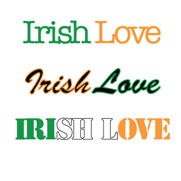
Above is the just text portion of my "Irish Love Skateboards" Logo

above is the two fonts portion of the logo

above is the text and art portion of my logo

this is the balanced art and text portion of the logo. This is my favorite part.

this is the portion that contains more art than text. I like the negative space created by the bend in the I and the L. I think the heart is still visible around the letters. Also, the inspiration for the logo design on the bottom was a deck of cards. I originally thought I should make them orange and green to go along with the theme of the rest of it, but I think it looks better with black and red.
Wednesday, November 28, 2012
Poster Pallette

Monday, November 26, 2012
Poster

Now enjoy this poster that took way too long to make :) I'm very pleased with it. How awesome would that concert be??? And on my birthday too... Very fun project!
Thursday, November 15, 2012
Matchbox Design

Friday, November 2, 2012
File Formats

ORIGINAL PICTURE

GIF 32 DITHERED

GIF 32 NO DITHER

GIF 64 DITHERED

GIF 64 NO DITHER

GIF 128 DITHERED

GIF 128 NO DITHER

GIF RESTRICTIVE

JPEG HIGH

JPEG MEDIUM

JPEG LOW

PNG-24

PNG-8 128 DITHERED
So... From this long sequence of pictures, we can see that visually PNG-24 is the best looking picture go the bunch. The file is very high quality, but it is a bigger file size at 139 kb. Not ideal, it even took a while to load the picture onto this post.
The lowest quality I see here is the GIF Restrictive file. The sky has turned into oil you see on the road and the trees almost look like they were photoshopped into the picture. That file is smaller at 25 kb. It is smaller, but not the smallest.
The picture with the smallest file size was the JPEG Low file. It's file size is 9 kb. Although it is compact, it's quality is maybe second to the GIF Restrictive file. The format is not very pretty to look at.
The picture with the best balance of quality and file size is the JPEG High format picture. It is 30 kb and the picture looks just crisp enough with out too much blur or pixels.
Now for the Gradient picture...
And may I say there are many versions of this picture like the one above, but for the most part they all look very similar and it was difficult to choose extremes of this one.

ORIGINAL PICTURE

GIF 32 DITHERED

GIF 32 NO DITHER

GIF 64 DITHERED

GIF 64 NO DITHER

GIF 128 DITHERED

GIF 128 NO DITHER

GIF RESTRICTIVE

JPEG HIGH

JPEG MEDIUM

JPEG LOW

PNG-24

PNG-8 128 DITHERED
Did you enjoy the mix of red and blue colors? I bet.
Of these pictures, the biggest file size is the PNG-24 at 79 kb, it is also the best looking quality, although the PNG-8 128 Dithered comes pretty close, that one is 16 kb. I would use the PNG-8 128 Dithered File format because it is significantly smaller that the PNG-24 and it looks almost exactly like the PNG-24 file. Another file that differs just a bit in quality is the JPEG High file format, that one is 11 kb. So If you're willing to sacrifice just a tad of HD quality, the JPEG High file format looks to be the best of this group of pictures to use on the internet.
The worst one of the bunch (visually) is the GIF Restrictive file format. So far, I'm really seeing this format as useless unless the colors you are using are black and white. The GIF Restrictive file is 6 kb. Quite small, compared to the other ones, but not the smallest. The smallest file size of these guys is the JPEG Low format at 4 kb. If you didn't mind that the picture was a bit blotchy and pixely, then I guess the JPEG Low file format would work well for this picture.
Overall, the JPEG High file format won in this decision. It has proved to be a good quality picture and a moderate file size that it is not too big for internet viewing. The worst was the GIF Restrictive file format, it always turned out blocky and had hard lines that did now work with most of the alternating colors.
PNG-24 is the best looking, and the biggest file format. JPEG High is a good looking medium size that is suitable for internet viewing. JPEG Low is the smallest size for file formats, but doesn't have near the quality of any of the other ones. GIF Restrictive is weird and doesn't work for anything unless it's a stickman in black with a white background. There are so many choices.... It just depends on what you would like to be viewing.
Tuesday, October 30, 2012

Monday, October 29, 2012
GIF

This is my first gif. It's the intro to a british show called Misfits. This was so touchy and eventually I just started over and then it worked perfectly.
Thursday, October 25, 2012
Front Street Kitchen

We had a design competition for our graphic design class, this is my entry for it. I'm pleased with it, and I'm happy the gradient worked for the wooden spoons. Never use the wood grain effect in Illustrator... It just looks like cork board! Anyway, I enjoyed doing this and I hope Front Street Kitchen likes it :)
Thursday, October 18, 2012
Typeface portrait

Tuesday, October 16, 2012
Extra Credit Pop Art
This is a Pop Art of Niall Horan, from the boy band One Direction. Tease me all you want, I still love him. And I love how this picture turned out!


Thursday, October 11, 2012
Creating My Own Typography

Subscribe to:
Comments (Atom)